Barbershop Logos
September 5, 2022
Barbershop Logos 101
Before customers are willing to pay for your barbering skills, they are likely to want to take a look at your brand. Every business’s branding begins with a logo. Therefore you should showcase your talent and style with a logo as sharp as your handiwork.
What is a Logo?
A logo is a symbol that companies use to help their branding gain recognition. It could be anything, from an abstract design to plain text. Logos are crucial to fostering trust in customers as well as giving some feeling to what customers might expect.
To establish the best barbershop logo for your business, begin by exploring the basics. You can also take a look at our compilation of barbershop logos to draw inspiration and understand what type of aesthetic makes the cut in this industry.
Read on to learn more about barbershop logos and how to create the best one well suited to your business.
Why Have a Logo at All?
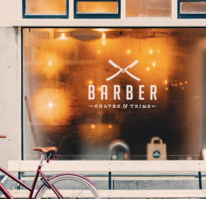
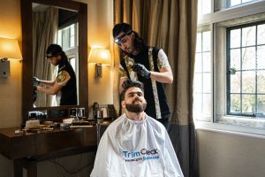
For a barbershop, the brand’s logo is the first interaction with a potential client. Whether they spot it on a shop’s window, a business card, or online, it must draw them in, not repel them or make them question the business’ authenticity.
A logo must be appealing enough to turn potential clients into paying customers. Moreover, a logo also fills the crucial role of encouraging frequent customers to remain loyal to (and even vouch for) the barbershop.
Ultimately, a good logo immediately tells onlookers that you are a professional while encouraging your target market to reach out to you for a haircut.
Four Fundamental Reasons why a Logo for a Barbershop Business is Crucial:
- It creates a great first impression for attracting new clients
- It helps a barbershop establish a brand identity while simultaneously encouraging brand loyalty
- Customers will remember the business better and regard it with more respect if it has a good logo
- It helps customers distinguish one barbershop from another
Things to Consider in a Barbershop Logo Design
Establishing a visual identity can set you apart from your competition. Numerous barbershop businesses pay minimal attention to their logo, which can be a huge mistake. For instance, they often fail to incorporate their brand with their mission statement.
Ideally, your logo should be bold and attractive to be recognizable, however simple the design might be. Your logo colours should also complement your branding.
For example, if your business colours are blue, you could make your logo navy blue. Do not just use any old logo on your window and business cards because it may not stand out or suit your brand. Once again, consider a logo that is unique, professional, and makes a lasting first impression.
The Fundamentals of Barbershop Logo Design
Before your mind starts racing with ideas, it will be good to consider what you should include when designing a logo for your barbershop.
– Icons
A logo may contain drawings, icons, symbols, or even text. Ideally, it should represent the service you provide, its central theme, and its environment. For instance, barbershops in metropolitan areas will have a different design than those in suburban regions.
Common icons include the following:
- A moustache
- A bearded person
- A skull with a beard
- Scissors
- A razor blade
- A barber pole
- The business name’s initial letter
- Combs and brushes
A crucial aspect to remember when designing a logo is that the icon must be versatile. It will appear in display pictures, in printed form, on the internet, and perhaps be used on some other platform. The icon you select must be resizable and clear, regardless of where it appears.
Barbershop symbols usually draw inspiration from the tools commonly used in hairdressing. All the symbols mentioned above are choice symbols for barbershop logos. You can also try a more metaphorical approach, e.g., abstract shapes and animals can tell clients about the spirit of your work.
– Branding
Branding refers to a consistent style, font, and colour scheme for all things related to a business. As mentioned, your branding style must be consistent whether you consider using printed business cards, social media, a website, or anything else.
A business’ branding gives a potential client a glimpse of what the company stands for. It also offers consistency so clients can recognise the industry with so much as a glance. The logo is the first part of the brand visible to customers.
To design a logo consistent with your brand, figure out what branding style you want for your business. Then move on to the logo design.
– Drawing in the Target Audience
Anyone with a successful business knows that the most attention-grabbing logos are not the flashiest ones. These logos resonate with your target customers. A barbershop is where boys and men get their haircuts and their beards styled or shaved. Therefore, the logo should appeal to that audience and invite them to give your services a try.
A good idea would be to put yourself in your customers’ shoes. What do you find universally appealing in a logo design? You could take that insight and put it to good use.
– Typography
Choose a font that mirrors your aesthetic if you want to focus more on a typography-based logo. The font you choose to represent your barbershop should reflect the nature of your target audience. A good way to go about this can be to choose a font that is legible and discernible the first time a potential customer sees it.
Some of the most Popular Fonts Barbers use:
- Helvetica
- Candida
- Calibri
- Clarendon
Besides these, Sans-serif fonts give a more modern feel and represent barbers offering trendy and high-fashion cuts and hairdos.
On the other hand, vintage fonts–given their classic appearance, are better suited for more traditional barbers.
– Colour Selection
Believe it or not, a colour scheme does much more for a logo than it may appear. It also goes beyond mere aesthetic appeal. As you may know, colours can impact human emotions as we are built to associate colours with feelings, personalities, and descriptions in general.
Examples of colours and their effects on Human Emotion
- Purple stands for regality and richness.
- Orange and yellow represent high energy and playfulness.
- Black is associated with elegance and sophistication.
- Gold is commonly linked to decadence, class, and royalty.
- Red represents energy and power.
- Blue signifies trust, peace, and stability.
- White symbolizes purity and exclusivity.
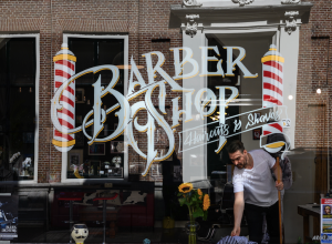
The most common colours in barbershop logos are white, black, blue, and red. Some businesses prefer a combination of white and black to portray elegance. This colour combination is also great for a window-displayed logo.
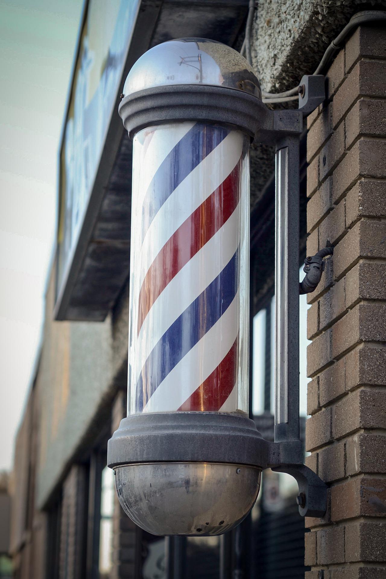
Other business owners in this industry use a blue, red, and white design synonymous with barbershops based on the ever-familiar and widely recognized barber pole.
Factors to remember while selecting a Barbershop Logo Colour Scheme:
- Ensure the chosen logo’s colour scheme matches your brand image and personality.
- Figure out how you want your prospective clients to feel when they see your logo. Then study the psychological impact colours have on people.
- Remember that your target demographic primarily consists of men; therefore, consider a colour palette that resonates with this gender. The colour pink for example might make some men think instinctively that the shop isn’t for them.
- The colours should blend with the overall design and not overpower the logo.
- Confine the colour palette to just two or three colours to avoid overwhelming the senses.
– Simplicity is Key
The primary goal of a brand’s logo is to be distinguishable and memorable. An overly complicated logo design could be unpleasant to the senses and possibly not unique enough to remember. Clients must associate your logo with trust and professionalism in this overly saturated industry. Classic and simple logo designs are easier to remember, hence more popular.
The world’s most famous logos are uncomplicated yet striking. For instance, call to mind Twitter’s logo or the Apple logo.
– Special Features
You can add a bit of zing to your logo with the addition of a few unique features. Separators and containers can add the illusion of structure to your logo, emphasizing and framing its central elements.
Find designs that have sharp lines and geometric shapes such as circles, triangles, and rectangles. Also, by stacking your logo, you could add visual layers to it. Such a layout adds an element of height. Lastly, you could try juxtaposing the severe shape with rounded text.
– Create a Unique Logo Design
Drawing inspiration from other barbershop logos and borrowing ideas from trends is usually a good start when deciding on a logo. That being said, the purpose of using a logo is to be prominent among your competitors.
There are various ways you can create an impressive barbershop logo. Examples include graphic stock platforms, logo makers, free templates, online software, or logo design contest sites. You can also hire a professional graphic designer to design a logo according to your preferences (such as www.99designs.com).
Contact us at barberhub@trimcheck.com
FAQs
-
A barber pole is a sign barbers use to represent the shop where they work. The trade sign dates back to the Medieval Ages.


